
Cry Baby Disposable: Packaging Style and Retail Appeal
In the disposable vape hardware category, packaging is more than a box around a device. For adult legal-market retailers and qualified wholesale buyers, packaging shapes how a product is received, displayed, compared, stored, and explained by staff. A disposable device may have a strong technical specification, but if the packaging is unclear, difficult to merchandise, or inconsistent with adult-only compliance expectations, it can create problems before it reaches the shelf.
The crybaby series gives retailers a clear example of how product identity, package structure, and shelf appeal can work together. The Cry Baby disposable format is recognizable because of its bottle-inspired design language, compact retail presentation, and visual connection to the LED screen disposable segment. For a buyer, the value is not only in the look of the product. The real question is whether the packaging style supports practical retail goals: quick product identification, clean display layout, simple staff explanation, organized backroom storage, and adult-focused merchandising.
This article reviews Cry Baby Disposable from a B2B retail perspective. It focuses on packaging style, retail appeal, LED screen relevance, shelf fit, and compliance-minded product copy. It does not make health, safety, medical, or smoking-cessation claims. Retailers should always confirm local age-verification rules, labeling requirements, shipping limitations, and product authorization standards before listing or selling any vape-related product.
Why Packaging Style Matters for Disposable Vape Retail
Packaging is one of the first things a retailer evaluates when deciding whether to add a new disposable device to the assortment. A strong package must do several jobs at the same time. It should protect the device, identify the SKU, support scanning or inventory control, display the brand clearly, and help staff distinguish the product from similar items. In a fast-moving retail environment, unclear packaging can slow down service and create confusion between sizes, formats, or brand families.
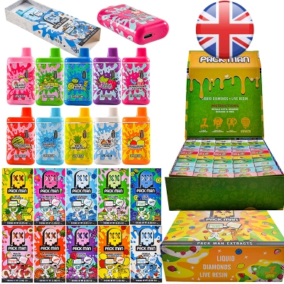
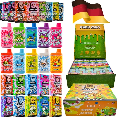
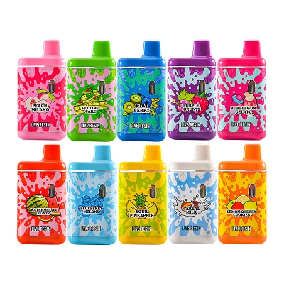
For Cry Baby Disposable, the packaging style is especially important because the product identity is visually distinctive. The bottle-inspired form gives the item a memorable silhouette, while the individual box and display box format can help wholesale buyers plan shelf organization. A display box can be useful when a retailer wants to keep multiple units together behind the counter or inside an adult-only retail case. Individual boxes make the product easier to count, scan, and separate by SKU.
Retail appeal should not be confused with broad consumer advertising. In a regulated product category, the safest B2B approach is to describe packaging in practical retail terms: shape, box format, display layout, labeling visibility, and store organization. Words such as “fun,” “candy-like,” or “kid-friendly” should be avoided. Packaging content should speak to adult retail buyers, not to minors or casual online browsers.
Cry Baby Disposable: What the Package Communicates
A good disposable vape package communicates three layers of information. The first layer is brand recognition. The customer or staff member should be able to identify the product family quickly. The second layer is hardware format. The package should make it clear whether the item is a disposable device, a cartridge, an empty device, or another accessory. The third layer is practical specification. Capacity, charging type, screen feature, and carton quantity should be easy for the retailer to confirm.
The cry baby disposable category is useful for retailers who want a dedicated page for this product style. From an internal linking perspective, this anchor should point readers directly to the Cry Baby Disposable page rather than to a general vape page. That creates a cleaner path from the blog topic to the relevant commercial category. It also helps the blog avoid keyword confusion, because “cry baby disposable” describes the specific destination more accurately than a generic phrase such as “view products.”
In the blog content itself, the package should be described with neutral, specification-led wording. For example, “individual box plus display box” is a useful retail description. “Cute bottle package” is less appropriate because it can make the product sound like it is designed for novelty appeal rather than adult-only retail presentation. When a product has a distinctive shape, B2B copy should explain how that shape helps shelf identification and staff handling.
LED Screen Appeal in Adult Retail Settings
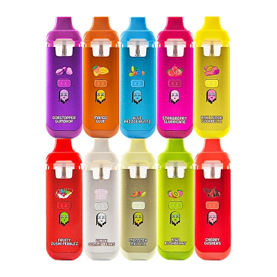
LED screen disposable devices have become a visible subcategory because the screen creates a more information-driven product experience. In retail merchandising, an LED screen can help distinguish one device segment from traditional screenless disposables. Buyers often place LED screen products together so staff can explain the difference between basic devices and screen-enabled models. This does not mean the screen should be marketed with exaggerated performance claims. It should be described as a device feature that supports clearer hardware presentation.
A relevant internal link to the LED Screen vape category helps readers understand where Cry Baby Disposable fits inside a broader hardware trend. This anchor is also valuable because it links the article to a feature-based category rather than only a brand-based category. For SEO and user navigation, that creates a more complete content path: brand page, product category page, and technical feature page.
For adult retail buyers, LED screen appeal is strongest when it is connected to simple merchandising language. A shelf tag might identify the product as “Cry Baby disposable with LED screen design” or “2ml disposable format with Type-C charging.” These are factual product descriptors. Retailers should avoid statements that imply safety, health improvement, or guaranteed performance. The goal is to make the hardware easier to understand, not to overpromise what the screen can do.
Display Box Planning and Shelf Fit
Shelf fit is one of the most important buying considerations for disposable vape retailers. A product may look attractive online, but it must still work inside the store’s display environment. Countertop cases, wall shelving, behind-the-counter drawers, and locked displays all create different needs. A display box can help present multiple units together, but it must match the retailer’s available space and inventory workflow.
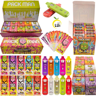
When evaluating Cry Baby Disposable packaging, buyers should check how the individual boxes sit inside the display box, how the front panel reads from customer distance, and whether the package name can be seen without opening the carton. Staff should be able to distinguish the product quickly during busy retail hours. If several disposable categories are stored together, strong shelf labeling becomes essential.
Many adult retailers organize disposable devices by capacity, which is why an additional link to 2g disposable vape pen can support the article’s structure. Cry Baby Disposable belongs naturally in a 2ml or 2g-style retail conversation, depending on how the store labels capacity. Capacity-based navigation helps buyers compare product families while keeping the shelf logic simple for staff.
Retail Appeal Without Compliance Risk
Retail appeal should be built around clarity, organization, and adult-only presentation. This is especially important for products with distinctive shapes or colorful packaging. Buyers should review whether the package could be interpreted as youth-oriented in the market where it will be sold. Even when a product is intended for adult legal-market retailers, the way it is described online can influence compliance perception.
A safer copy strategy is to focus on wholesale and retail operations. Instead of emphasizing playful design language, describe how the package supports store display, SKU separation, visual recognition, and product handling. Instead of highlighting flavor names in a promotional way, focus on assortment planning and local compliance review. Instead of saying a product is “safe,” “healthier,” or “better for quitting,” use neutral hardware terms such as capacity, charger type, display box, LED screen, and retail packaging.
Adult-focused retail appeal can still be persuasive. A buyer wants to know whether the product is easy to stock, easy to explain, and easy to reorder. A clean blog can make those points without aggressive sales language. For example, a sentence such as “The individual box and display box format can help retailers organize Cry Baby Disposable units by SKU and capacity” is useful and compliant-minded. It gives the buyer a practical reason to consider the product without making risky claims.
How to Merchandise Cry Baby Disposable Online
Online merchandising should mirror in-store organization. The blog title should include the main product phrase and the buyer benefit. A strong title is “Cry Baby Disposable: Packaging Style and Retail Appeal.” It is clear, concise, and aligned with the article’s purpose. The H1 should match the title or stay very close to it. The meta description should summarize the article for adult wholesale and retail readers without using hype.
Internal linking should be natural. The first link can point to the brand category. The second link can point to the product-specific disposable category. The third link can point to the LED screen feature category. A fourth link can point to capacity-based navigation. A fifth link can support a broader retail comparison page. This structure helps readers move from education to product discovery without feeling forced through a repetitive anchor pattern.
A useful fifth anchor is dual chamber vape, not because Cry Baby Disposable must be treated as a dual-chamber product, but because it gives qualified buyers a path to compare other advanced disposable formats. This type of internal link is stronger than a generic homepage link because it connects the reader to a related hardware category. It also creates a more complete disposable vape content cluster.
Retail Staff Training Points
Retail staff should be trained to explain Cry Baby Disposable in factual terms. A short product note might include the product family, disposable format, oil capacity, charging type, LED screen design, and packaging arrangement. Staff should avoid unsupported claims about health, safety, medical use, or smoking cessation. They should also avoid language that makes the product sound like a toy or youth lifestyle item.
A practical staff explanation could be: “This is a Cry Baby disposable hardware format with individual packaging and display box presentation. It is part of the LED screen disposable category and is intended for adult legal-market retail use.” This type of language keeps the discussion focused on product identity and retail classification. It also helps create consistency between the blog, product page, shelf tag, and staff training sheet.
Wholesale Buying Checklist
Before adding Cry Baby Disposable to a retail assortment, wholesale buyers should review packaging, display space, carton quantity, shelf labeling, and compliance requirements. The display box should fit the store’s counter or storage area. The individual package should be easy to identify. The product page should match the physical product details. Staff should understand how to describe the product without making risky or unsupported claims.
Buyers should also compare Cry Baby Disposable with other LED screen and 2g disposable options. This comparison can help determine whether the product fills a clear shelf gap or duplicates an existing item. The strongest reason to add a product is not simply that it looks different. It should also support a clear retail role, such as expanding the LED screen section, adding a recognizable brand-family option, or improving the store’s 2g disposable assortment.
Final Takeaway
Cry Baby Disposable can be presented effectively when the blog focuses on packaging structure, LED screen relevance, shelf fit, and adult retail organization. The packaging style gives the product a recognizable identity, while individual boxes and display box presentation help retailers think about storage and merchandising. The LED screen connection gives the product a feature-based category path, and the 2g disposable context helps buyers compare it with similar capacity products.
The best content strategy is clear and compliance-minded: use the main keyword in the title, keep the H1 aligned, describe the packaging in practical retail terms, include five relevant internal links, and avoid youth-oriented or medical claims. With that approach, a Cry Baby Disposable blog can support search visibility, product discovery, and better wholesale decision-making for adult legal-market retailers.
```
0 Comments